Inventory App: Product Design and Research
 The challenge
How might a global agriculture company provide credible and tailored recommendations to individual producers?
 About the Project
Only after understanding a user’s context can you design her experience. Consider the context of a user managing a herd of cattle. How do her past experiences, current environment, and current emotional state affect how she perceives a new app that manages livestock inventories?

Is she disappointed with the herd's performance? If so, why? Perhaps she is struggling to estimate the number of young female cows (i.e. heifers) born each year.
Is internet access necessary to run such a calculation? Why? Maybe a rural facility doesn’t have reliable wifi or cell coverage.
Does she defer the task to another user? Why? Many times such tasks are performed by a visiting sales rep.

Past State
In the case of Dairy Herd Inventory Tool, the client’s sales reps had previously used a trusty, albeit clunky, spreadsheet to perform calculations when visiting their customer’s rural facilities. Although the spreadsheet provided a result, the experience of retrieving it was poor.
To improve the tool, we needed to marry users' input with the application's output within a helpful visualization. Visualizing calculations on screen proved difficult for both the rep and customer: data inputs were untethered to resulting outputs; smallish, static diagrams describing the data were arcane and bewildering.
Understanding a user's context
 A portion of a user flow demonstrating one of the various interactions between sales reps and customers ( View image )
Future State
We remedied these issues by closely aligning inputs, outputs, calculations, and visualizations. The calculations were made automatically upon input field changes, providing immediate visual feedback to users. The previously unhelpful static diagram was transformed into a visual flow chart describing the calculation. The chart displayed the input and output fields as well as related information such as benchmark values. Users were able to directly correlate an input or output to its underlying step of the flow. And when used in a group setting, the visualizations were easily seen and understood by nearby viewers.
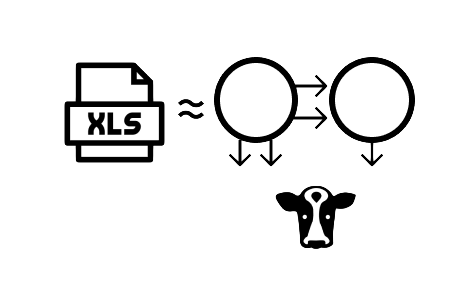
![]() input + calculation = output and visualizationUsers were able to directly correlate an input or output to its underlying step of the flow.
input + calculation = output and visualizationUsers were able to directly correlate an input or output to its underlying step of the flow.
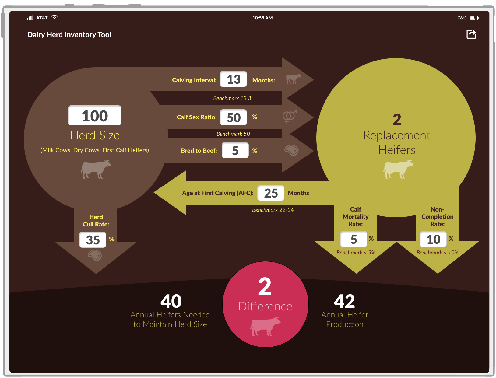 Mockup of the new inventory iPad app ( View image )
Other Notable Projects
- Strategy and/or UX of several native and hybrid mobile apps for banking- and insurance-sector companies
- Product design and UX for a AI-driven asset tracking system for a multinational retail corporation
- UX, IA, and service design for an employee benefits company's SaaS offering
- UX and IA for numerous consumer package goods (CPG) ecommerce websites, multiple CPG brand websites, and several social media games and sweepstakes